Color is more than just the use of pinks, browns, greens, and blues. Color creates a mood and enhances the comfort level of your home. It can heighten the excitement in a room, or it can soothe one’s nerves. Most people don’t spend lots of time thinking through color schemes and design even though it can reflect the family that lives inside.
When working with color, I suggest you first select the color for the largest areas of the room – primarily the walls and floors. Then, think about providing your room
with a bit more design flair, by adding a second color to one wall – calling it out in a dramatic and fashion-forward way. By adding some drama to an accent wall, you can also use this color to enhance other elements in your room’s décor such as accessories, draperies, furniture fabric, lampshades…even artwork.
When properly planned, careful color selection for each room in your home will help give your rooms their distinctive character and personality. Don’t be afraid to be creative with color!
No matter what you are adding to your room, you can learn about the psychological effects of color in interior design in order to create a space that works best for you.
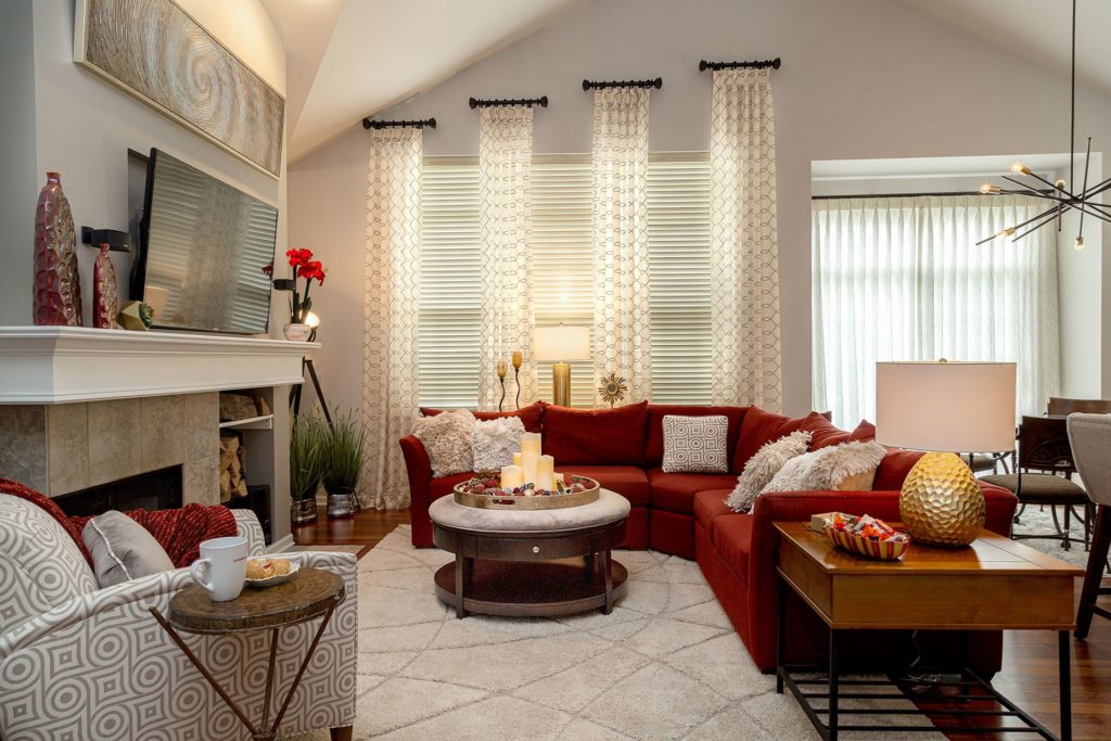
Red
Red is a powerful color that provokes strong emotions. Adds visual weight and energy to a room. Children and infants respond well to red, which is why it is a good color for preschool and child care facilities. It can also be used as an accent to a room, creating an energetic and passionate feel.
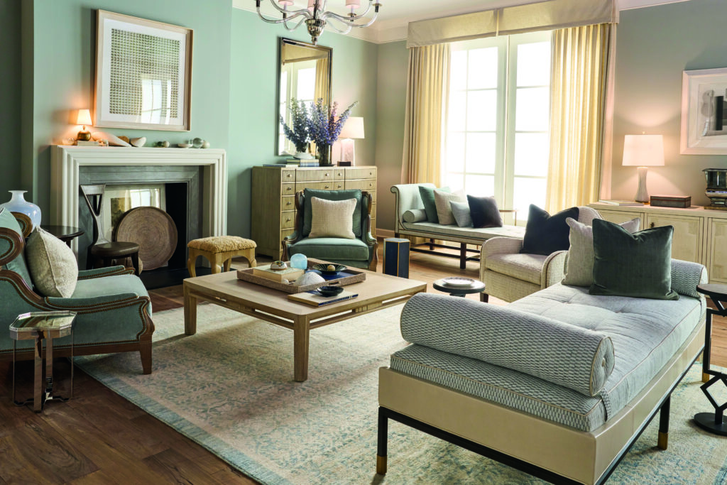
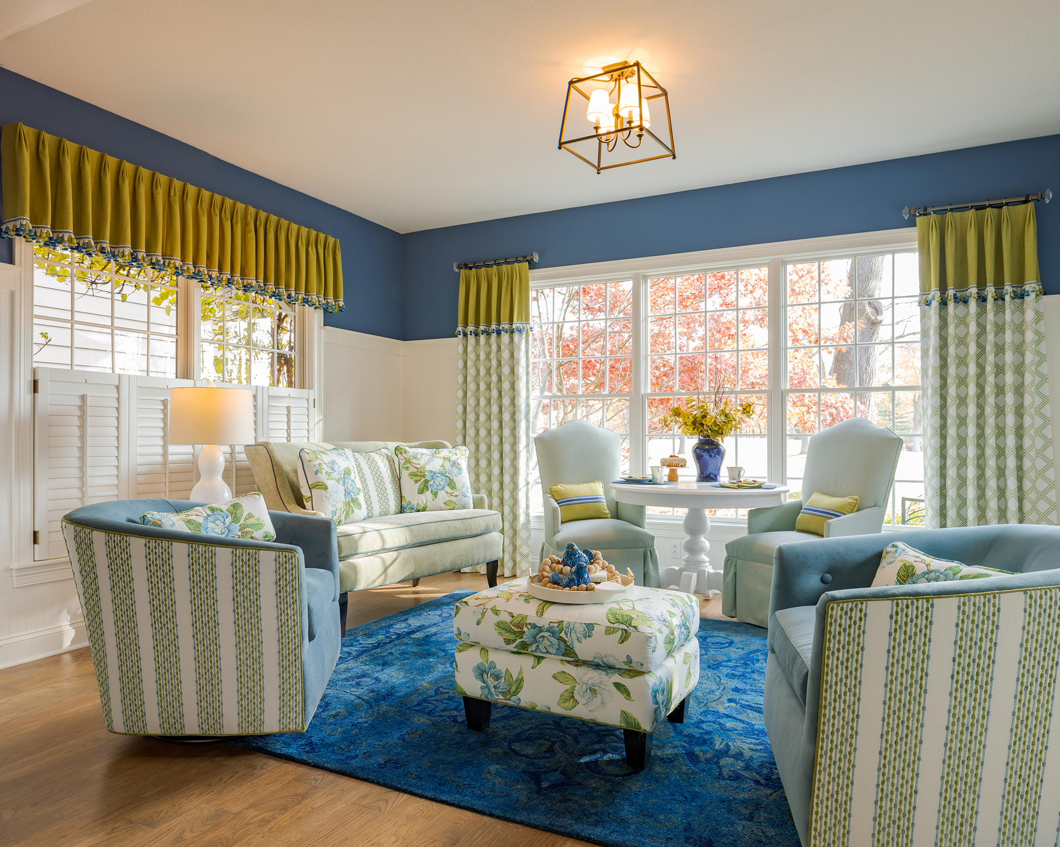
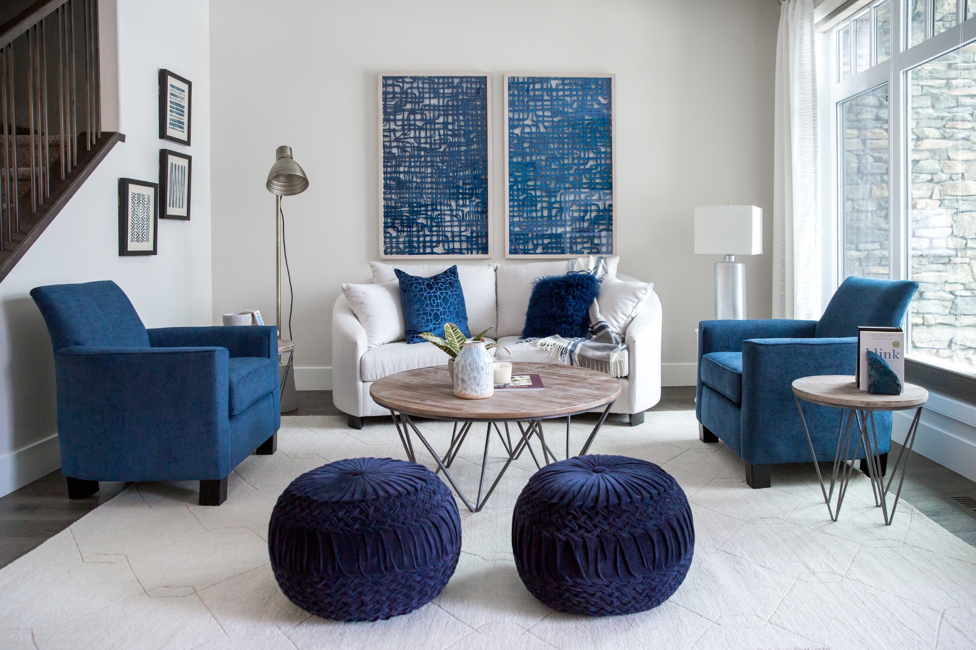
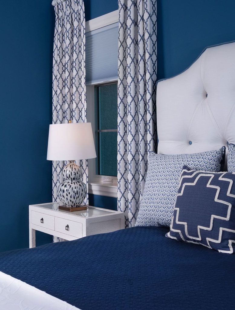
Blue
Blue causes the brain to send off eleven chemical tranquilizers; it is a wonderful, calming color. It is said that this color lowers blood pressure and slows the heart rate and respiration. Psychologists advise against using blue where food is served because it is said it can decrease appetite. Instead, think about using the color in the bedroom, bathroom or home office to create a relaxing environment.
In color psychology, yellow is associated with positivity, summer, and happiness. Even though it can be a cheerful color it should be used carefully to not overpower a room. Yellow is an attention grabber so it can be a lot on its own, which is why you should think of mixing it with other colors so they can compliment each other. It is best to use yellow to brighten a dark room using the room furniture, curtains, vases, etc.

Green
Mother Nature’s color. It reminds us of nature and brings that to mind into the room. Green calls for balance and growth in color psychology. In a room, it can encourage comfort, togetherness and allows us to unwind. It can tone down a sunny room and calm us in a waiting room.


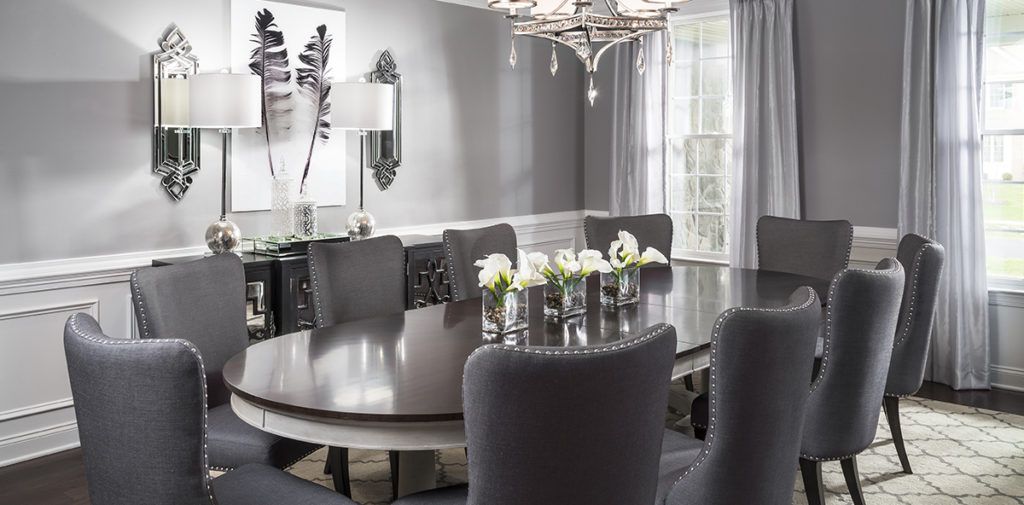
There are many different possibilities with the color grey. Depending on the shade you use you can evoke different feelings such as elegance and calmness. It may be best paired with white and other neutrals for a monochromatic feel but it doesn’t stop there. It can also be used as a background color allowing more intense colors to shine. I recommend using gray as a backdrop in combination with other colors. It’s a great neutral.

Black
Black is a tricky color to work with in interior design. The color black produces a feeling of solidarity and normality. Too much of it can make a room feel unwelcoming though. If not used right it can make a room seem too dark or small, as light doesn’t show form well since it is absorbed instead of being reflected. When used correctly, in small amounts with its completely and contrasting colors, black can add depth and elegance to the room.